How a Visual Text–and Digital Journalism– can Teach You what is meant by a “Reality Effect”
At various moments in this site, you’ll find me drawing your eye to examples from the visual arts–primarily, from traditions of painting. I’m doing that to teach you a few things about what is sometimes called a “reality effect.” This is the main subject of Chapter 3.
More than many forms of writing, journalism often builds its authority around seeming “real” to us. As I explore more fully in Chapter 3, when we say something seems “realistic,” we usually mean one of two things. First, we praise a work of journalism–which is, after all, built upon facts–as “realistic” when it seems to be showing us how things really happened. In a second and overlapping sense, we call writings realistic when they make us feel as if we are really experiencing the event ourselves.
That’s an understandable first reaction. But there are two problems here. First, the ways of thinking above can make it seem like a work of journalism is just a transparent “window” into reality rather than–as I say throughout this site–a “lens” that shapes how we see. In other words, it makes us overlook how the style of writing we’re looking at contributed to making things feel “real” to us. And that’s the first sense of a “reality effect”–it’s a matter of style, of how something is made to feel real, independent of the contents of what we’re reading.
That last clause–“independent of the contents”–points to the other problem we have if we think a work of journalism is “realistic” because it seems like we’re “there.” The problem is–well, that we quite often haven’t been there at all. And as such, we may not really have any criteria based on content to say what something is “really.” like.
And the problem goes deeper. For instance, if I give you the phrase “mushroom cloud,” you probably see something like this, in your head:

But the thing is, I didn’t say “Atom Bomb cloud”–it’s just that you made the visual connection yourself, intuitively, and even though you’ve never seen an actual Atom Bomb explode. The connection you intuitively made is both in language (“mushroom cloud” has become a kind of shorthand phrase, over time) and, very importantly, in the prior ways you’ve been able to visualize the Bomb itself, from movies or documentaries or news photos. In other words, the image is a “second hand” image–not something you’ve seen yourself, in person.
And when you think about it, many scenes we “visualize,” that we have in our heads, are second-hand. You may or may not have been to the Grand Canyon, or been in a war, or jumped out of an airplane with a parachute–but you can visualize those things because you’ve seen something that makes you feel you can. And when we say a writer or painter or film-maker makes something “realistic,” part of what we’re sometimes saying is that it conforms to what we’ve already got in our heads. See the potential contradiction?
One additional consequence of that second-hand status, moreover, is that you often “see” the cloud from a certain perspective: in this case, from far away, or usually from above. For example, you’re not visualize the Atom Bomb, say, from the point of view of those people who were being bombed. And so, that’s the first important thing about a second-hand visual image: it often “places” us through the use of perspective. This is the way that paintings or photographs use what, in reading a print narrative, we call “point of view.” Any image, in other words, includes a position from which things are seen. And so, once again, a “reality effect” is an effect of style–not the content, say, of looking at a bomb cloud but the way we’ve looked at it.
What, then, makes something “realistic”?
What you can learn from the above is that it isn’t only the “content” of an image that makes visual texts like paintings seem “realistic”–instead, it’s also a set of conventions that have developed over time to make viewers feel like they’re looking at something that is authentic, sometimes even that they are present to it. (Not always present–and that’s important. Would you want to be present to an Atom Bomb?)
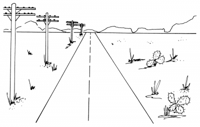
For instance, think about how painters or photographers use perspective to create feeling of depth in a drawing–as here:
Some part of us knows these are really flat, one dimensional things–pieces of paper with marks on them. But our mind “goes with” the conventions that create the illusion–again, the “effects.” Some paintings intrinsically seem more “realistic” even though their contents are relatively the same. Take, for instance, a pair of paintings of a rural, “peasant” woman.
The first one is on the left. In this painting, our eye basically feels we’re getting something that “looks like it would look” in real life.
But then, look at the second one, on the right.
")
Here, we’re getting an abstract rendering of the same subject. That is, if the model for the peasant was in the studio sitting in front of the artist’s easel, it would be the same woman in each case. It’s just that the one above uses “conventions” of seeing that we’ve come to think of as realistic. Likewise, the painting below works to combine various aspects of depth, perspective, and portrait to focus our eye on some things/figures–and then shift to others.
")
Recent Attempts at Digital Journalism
And finally, let me just leave you with this: these days, through various experiments in “digital journalism,” there is a wide attempt to recreate what a story tells us by using visual texts. Or, in many instances, to use charts or graphs to create what is now called “data visualization.” This is really only an extension of the multimedia-impulses that were already in journalism from the get-go, in the 19th century–e.g. with pen and ink “sketch work” or flash photography. If you’d like to see some of these sites, here are few links below. Enjoy!
“Snowfall“–the story of an avalanche, from the New York Times.
From Migrants to Refugees, from Univision
Firestorm. The Story of a Busfire in Tasmania
The Russia Left Behind. Following a Migratory Path
New York Times Essay on Homeless Students
ProPublica on Houston and Hurricane “Readiness”
An article on digital journalism and multimedia tools as a way to discuss climate change